Remember how you felt when you entered a space that made you instantly relaxed? Welcome to the power of colour, folks. Analogous colors might be something you remember from school art lessons, but it’s a great way to add life to our homes.
It allows us to create a calming yet vibrant space. No more clashing or clashing or clashing. If you want to learn how to use analogous colors in design work – the calming meets the creative – then let’s get started.
Understanding Analogous Color Schemes
Let’s first break down what we mean by an analogous color scheme. In terms of color theory, analogous colors are those that are adjacent to each other on the color wheel.
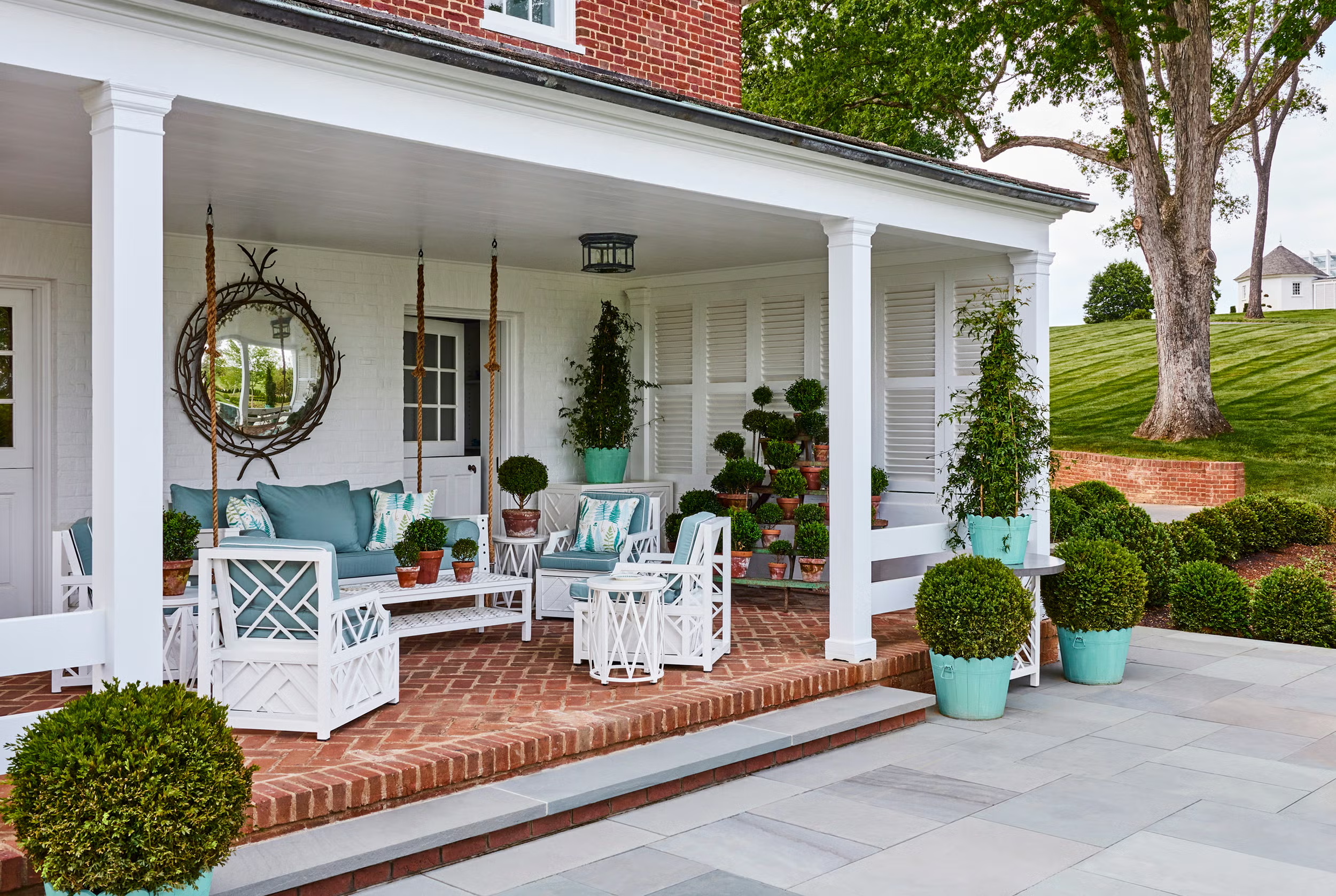
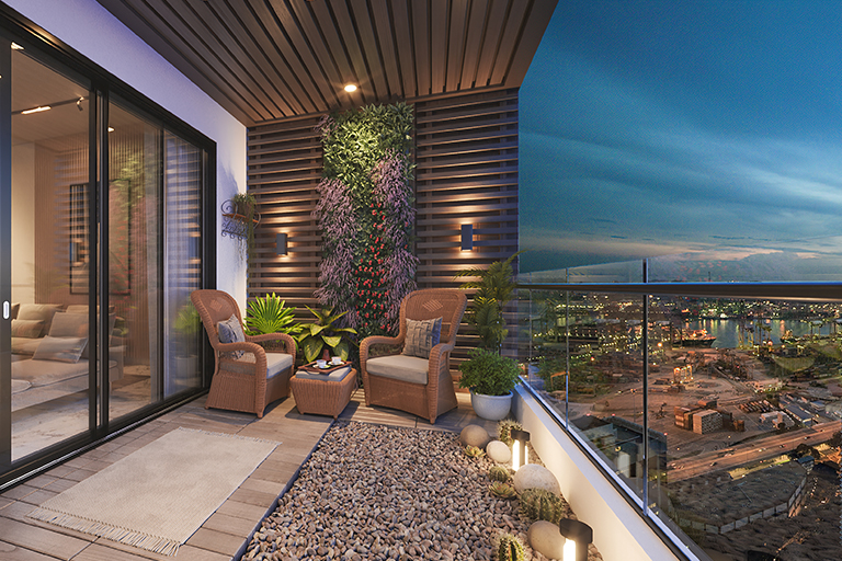
This could be warm colors such as red, orange, yellow harmoniously coming together or cool colors such as blue, teal, and green creating a serene environment. When we combine these colors, we get a harmonious look that can appear unified and organic.
In our interiors, these pairings can be dramatic or subtle, as we apply them to our spaces. They add dimension to our rooms without being overstimulating. So, whether we want a serene oasis or an energetic space for socialising, using analogous colors in interior design is a powerful choice.
The Advantages of Analogous Colors in Interior Design
So why would we want to use an analogous color scheme for the interior? Well, for one thing, it offers harmony. They blend well together and transitions are smooth. This can be especially useful in open-plan rooms where a continuous look is needed.
And we can create certain moods using particular analogous colors. Warm tones bring energy and warmth: cool tones are calming and relaxing. And, they also provide a degree of flexibility, so we can play with accent colours without the risk of clashing, double win. Who wouldn’t want to design an enticing space that appeals to all?
And finally, analogous colors can even be used to accentuate certain parts of a room. By making one colour the focus and others the accent colours, we highlight certain aspects. It’s like making our favourite painting stand out by framing it with other colours.
How to Choose Colors for Your Room
Selecting the right colors for our analogous scheme can be an adventure. We usually begin by identifying a main color. We then find colors to the left and right to pair with it. If green is our dominant hue, then blue-green and yellow-green are good matches.
We must also take into account the lighting, size and purpose of the room. If we have a small room, we may want to opt for lighter shades to make the space feel larger, whereas in a larger space, we may want to use darker tones to make the space feel warmer and more intimate. Testing samples in our environment under various lighting conditions can be a good indicator of what might work best for us.
Tips for Working with an Analogous Color Scheme
Using an analogous color scheme doesn’t need to be a difficult task. Here are some tips to help make it an easy and pleasurable journey:
Test Your Palette: By using paint samples, we can see how the colors work together and with our furnishings, fittings and daylight.
Keep It Balanced: We can be tempted to use all of our favorite colors, but it’s important to keep a balance. For example, it’s best for us to overpower our room with a primary color and complement it with the other accent colors, so that our design is both bold and balanced.
Add Textures: By incorporating different textures, such as soft textiles, glossy metals and coarse woods, we can enhance our style without causing conflict. Textures can tone down and even the most intense colors, and create mood.
Successful Analogous Color Designs
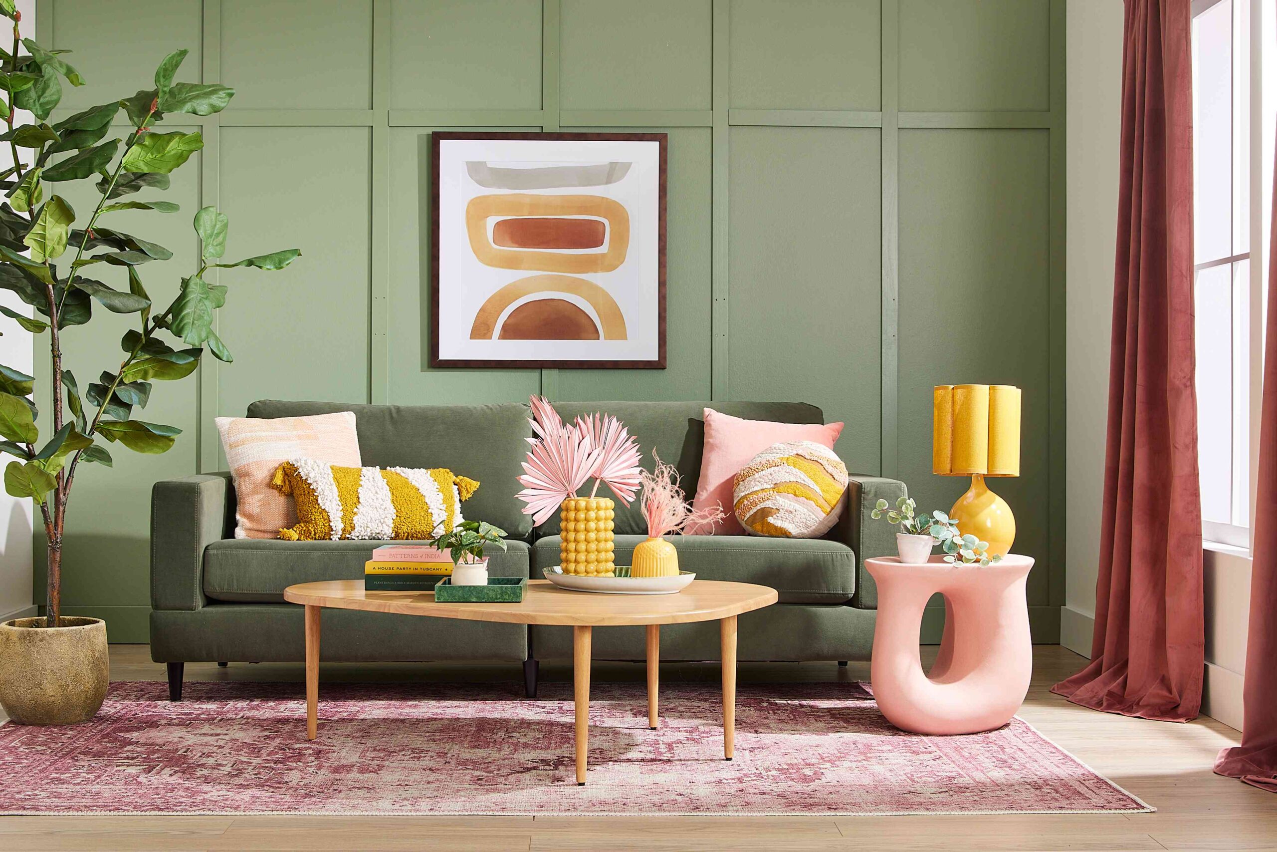
Let’s look to the world around us for examples of analogous color schemes. We could imagine a warm, inviting living room using orange as the main color, and accents of red and yellow. This might result in a warm and welcoming environment, suitable for entertaining guests.
Or, we could picture a calming bedroom painted with tones of blue, teal and green. This type of palette can make our bedroom a peaceful environment, conducive to clearing our minds before we sleep.
Or perhaps an office space with a gradient background from soft greens to soft blues that can promote creativity and focus.